Class Lab 2
Setting Up
This week, we are going to revisit some of the commands and analysis that we did before and add a few new tools. Before starting, I downloaded the data and put both datasets in the the “data” subfolder of my “rpad316” folder I created in class lab 1. I will set my class folder as the drive that I will be working from in my .do file. Now, we are going to open a new Stata window - just open Stata on your computer. It should be empty with no data loaded and no variables listed in the upper right “Variables” viewer. In your fresh Stata window, open a new .do file (click 
cd "E:\rpad316\"
Remember, you’ll want to replace the E:\ above with the path to your own class folder. This simple practice of doing all of your analysis in a single project folder can help you save time in your code and reduces opportunities for errors. What the command does is it tells Stata to look for all files that you reference and save all files that you create in that folder. That way, instead of including the entire path in your code for each output command or each save command, you can simply list the subfolder and name the new file. You’ll notice we are only working in a do file without any data loaded yet. Now, let’s call up the data and start our log file.
use "data\dataset3.dta"
log using "logs\class2.log", replace
Now, let’s highlight the three lines of code we have in our .do file (you can use your mouse or on your keyboard, press Ctrl + A) and click the “Execute” button. Now, if you switch to the Stata window, you will see the data is loaded, the variables in the dataset are listed in the “Variables” viewer, and a log file has been started. We are ready! From here on out, this will be our starting process for labs and homeworks. Go slow, take things one step at a time, and make sure we are all set up before running commands. In future labs, I will refer to these steps as the “Setup Steps” and you should start every lab and homework with these steps.
Tip: As you you work through commands in Stata, type out the code from our class labs in your .do file, then highlight and execute it to produce graphs or tables to ensure you are on the right track as you go.
Graphs and Correlations in Stata
In this example, and your homework, we will be working with data from the American Community Survey or the ACS. The ACS is one of the largest on-going public data collections in the country. It is an annual survey run by the U.S. Census Bureau that collects large, representative samples of respondents across the county and collects data on a variety of aspects of their daily lives. The ACS provide information for policy makers and entrepreneurs alike and is an incredibly valuable resource.
Review
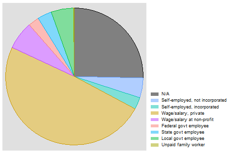
Let’s start with a simple pie chart of the class of workers we have in the sample. This requires two variables - one that identifies the unit of observation and one that identifies the categories we’d like to see plotted into proportions of the sample. In the ACS, we are going to create a variable named caseid to provide a unique identifier for respondents, our unit of observation currently, and the extant variable classwkrd provides a categorical variable of different classes of workers in our sample. Class of worker helps us better understand how many workers are working in different sectors of the economy. Creating a variable for caseid lets us practice creating variables and lets us learn a new piece of Stata - how to tells state to use the observation number in a command. In Stata, _n refers to the row number that defines a particular observation or the observation number. Generally, this is passive information, but in this case, we can simply tell Stata to use this to create a unique numeric case number for each respondent that is equal to their observation number. The code will look like this:
gen caseid = _n
This tells Stata “generate a new variable called caseid and set it equal to the row number of the observation for each observation.” Let’s go ahead and label this variable too so we know what it is.
label var caseid "Numeric case identifier"
We can now use caseid and classwkrd to create a pie chart just like we did in Class Lab 1:
graph pie caseid, over(classwkrd)
graph export "output\piegraph_c2.png", as(png) replace
Remember that a pie graph is plotting the percentage of observations in each category of a variable. Each slice of the pie is asking “of the total number of observations, what share of them are in category a?” or, in simple math terms, a/n. However, to do this, Stata needs to know what to count as observations so that it knows the n for the denominator and can count the number of observations in each category. Stata also needs to know what categories to use for bunching observations together. The first line of code is telling Stata to use caseid to define that observations we want to include in our pie graph and to use classwkrd as the categories. The second line of code tells state to send this pie graph to our output folder so we can use it in a report or write up or blog or any purpose we have for creating and sharing this graph with the outside world. Notice that I added _c2 to the name of the file - this is so it doesn’t replace the piegraph we made in Class Lab 1. You should now have a pie graph that looks something like this:
Of course, a similar function - getting a sense of how many observations fall into each category in the class of worker variable - can be served in bar graphs, like we saw in Class Lab 1. Here, we would use a similar logic in our code:
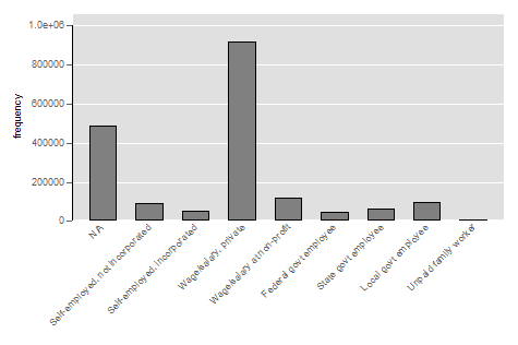
graph bar (count), over(classwkrd, label(angle(45)))
graph export "output\bargraph_c2.png", as(png) replace
Notice here, I am not defining the units of observation to Stata. I am telling stata to just provide a count of observations, a segment of the command that must be in parentheses. Notice also that I have added instructions to Stata. In addition to telling Stata which categorical variable I would like to see bars for, I am telling Stata to angle the labels in the graph at a 45 degree angle. This option is important because, as you’ll see, some of the category labels are long and angling them prevents them from running into each other and being illegible. Finally, note that every opening parenthesis has a matching closing parenthesis - Stata will get confused if you leave any open ended parentheses. Now, executing these two lines should produce a bar graph that looks like this:
Switching Datasets
Remember how we added two datasets to our data folder? Now, we are going to switch to a different dataset. This gives us an opportunity to learn how to code this kind of switch in our do files. Here, we are going to include three lines of code: one that tells Stata to save the current dateset, one that tells Stata to close out the current dataset, and one that tells Stata to use a new dataset.
save "data\dataset3.dta", replace
clear
use "data\dataset2.dta"
The save command tells Stata to overwrite the previous version of dataset3 and replace it with the current version. We didn’t make any changes to the data, but it is a good habit to get in to save your data before you clear it. Intuitively, clear simply tells Stata to remove the current dataset from Stata. Finally, just like our “Setup Steps,” use tells Stata to load the second dataset. Dataset2 has cities as the unit of observation and we are going to focus on the relationship between the average years of education in a city and the average wages in the city.1
Let’s look at a histogram of average wages in the cities in our dataset.
histogram incwage_avg
graph export "output\histograph_c2.png", as(png) replace
Which will create a graph that looks something like:
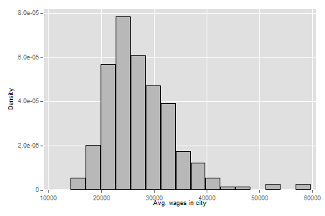
We can see that the modal city has an average income of just under 25,000 per year. But we can see some cities way out in the wings where the average income is just shy of 60,000.
Now, let’s use histogram years_education_avg to take a look at the distribution of years of education in cities:
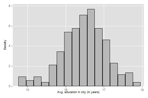
We can see that cities tend to have a pretty high level of average years of education. The modal city is just over 16 years of education, or just a little more than a 4-year college degree. Some cities out in the wings have an average of a Master’s degree while others at the lower end have an average education level of an Associate’s degree.
Now, let’s look at the summary statistics of these two variables. Code: sum incwage_avg years_education_avg, detail for the output:
                     Avg. wages in city
-------------------------------------------------------------
      Percentiles      Smallest
 1%     16693.85       14201.85
 5%     18535.88       16062.57
10%     20610.69       16693.85       Obs                 260
25%     23067.29       16876.72       Sum of wgt.         260

50%     26302.13                      Mean           27484.37
                        Largest       Std. dev.      6657.912
75%     30780.66       52158.75
90%     35340.75       52847.92       Variance       4.43e+07
95%     38859.85       57830.73       Skewness        1.43189
99%     52847.92       59768.31       Kurtosis       6.950217

              Avg. education in city (in years)
-------------------------------------------------------------
      Percentiles      Smallest
 1%     14.80036       14.76064
 5%     15.37991       14.77651
10%     15.76941       14.80036       Obs                 260
25%     16.13249       14.82953       Sum of wgt.         260

50%     16.51912                      Mean           16.47657
                        Largest       Std. dev.      .5820879
75%     16.85285       17.66913
90%     17.17049       17.72148       Variance       .3388263
95%      17.4083       17.81018       Skewness      -.4133086
99%     17.72148       17.96009       Kurtosis       3.533844
Relationships of Two Variables
Of course, we are more interested in the relationship between education and income. Do cities with more educated workforces have higher average wages? To do this, we are going to start with a scatterplot of these two variables. While plotting data points for 260 cities would be time consuming to do by hand, Stata makes our life easier. We can make scatterplots with the simple and intuitive command scatter with a command structure of scatter var1 var2 where var1 is the variable we want on the y-axis and var2 is the variable we want on the x-axis. We are currently thinking about wages as our outcome from education and it is good to get in the habit of thinking about your outcome variable as your y-axis variable more generally. Let’s make our scatterplot:
scatter incwage_avg years_education_avg
graph export "output\scatter_c2.png", as(png) replace
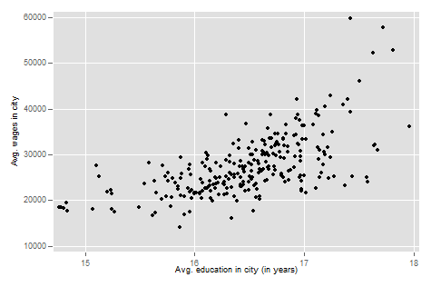
Finally, let’s go ahead and calculate the r, sometimes referred to as the Pearson’s r for Karl Pearson who developed the measure in 1948 (informed by previous work), using Stata. While you will do this by hand and show your work in your homework, in Stata, calculating the correlation coefficient between two variables is quick and easy.
As we noted in class, the Pearson’s R comes from the formula:
\[r = \dfrac{1}{n-1}\sum^n_{i=1}(\dfrac{x_i - \overline{x}}{s_x})(\dfrac{y_i - \overline{y}}{s_y})\]That’s a lot to calculate, even ignoring that s means we have to calculate standard deviations! Thankfully, Stata makes this simple with the pwcorr command. Here, we will tell Stata to estimate the R coefficient that describes the correlation between cities’ average education levels and average earnings.
pwcorr incwage_avg years_education_avg
…and we will see this output:
. pwcorr incwage_avg years_education_avg

             | incwag~g years_~g
-------------+------------------
 incwage_avg |   1.0000
years_educ~g |   0.6332   1.0000
We can see that the Pearson’s R for education and wages is 0.63. An r coefficient of 0.63 suggests average education levels in a city and the average wage rate in the city are positively correlated and the association is relatively strong. Here’s a table with a simple rule of thumb for thinking about how to interpret R coeffiecients, generally:
| R Coefficient Value | Strength of Relationship |
|---|---|
| 0.1 < |r| < 0.3 | Weak |
| 0.3 < |r| < 0.5 | Moderate |
| |r| < 0.5 | Strong |
Note: As with many things in statistics, there is some art to interpreting estimates and some of the subtleties and nuances will be context specific. Theory and the characteristics of your sample and data will have a large influence in how you think about the strength of a relationship. The more you learn statistics and work with data in a particular area of public policy, the more familiar you’ll become with what characterizes strong and weak relationships in your context.
We can use the same command to look at the correlation of multiple variables at once. Let’s add rent to the mix (pwcorr incwage_avg years_education_avg rent_avg) to see how things look:
             | incwag~g years_~g rent_avg
-------------+---------------------------
 incwage_avg |   1.0000
years_educ~g |   0.6332   1.0000
    rent_avg |   0.5688   0.4199   1.0000
Here, for the relationship between average wages and average rent, we get an R coefficient of about 0.57, which tells us average rent in a city increases as the average wage rate in a city increases and the association is a bit more moderate than the link between education levels and wage rates.
As always, we want to end our do file with log close.
-
For those of you who are interested, dataset 2 was created using dataset 3. Using the commands below, I created variables that captured the city averages of some variables of interest.
sort met2013
egen incwage_avg = mean(incwage), by(met2013)
label var incwage_avg "Avg. wages in city"
egen years_education_avg = mean(years_education), by(met2013)
label var years_education_avg "Avg. education in city (in years)"
by met2013: drop if _n > 1
save "dataset2.dta", replace
