Class Lab 3
Review
We will be working with data from the Education Longitudinal Study of 2002, a nationally representative sample of high school sophomores in 2002 who are tracked periodically into their adulthood. Unlike the repeated cross-sections of the ATUS and the ACS from previous labs where a new sample with new respondents is surveyed each year, the ELS collects data using the same people from the initial year throughout the period of the data collection. This design is commonly referred to as a panel design. We will use this data to examine intergenerational inequalities, but first, let’s use this opportunity to practice some of our skills learned in previous labs using this new data. Remember to begin your do file by running the line cd "E:\\rpad316\" where the E:\ part is replaced with the path to your class folder, where you have placed the data and so on.
Let’s start with a simple look at the demographics of our sample. I happen to know that the labels for these categories are quite long so we are going to want to angle the labels on the x-axis like we did last week.
Tip: For more polished and professional looking graphs, I recommend running set scheme lean2, perm in your command window. In Stata, schemes can automate a lot of the formatting and layout details of making graphs better looking than the standard Stata output. The , perm option tells Stata to set your graphs to default to this style scheme going forward until you tell Stata to do something different. There are many other schemes you can use in Stata - from user created schemes that mirror 538’s style to Stata included options that mirror the graph styles of The Economist.
graph bar, over(byrace, label(angle(60)))
graph export "output\bar1_lab3.png", as(png) replace
The distribution of student race in the ELS resembles demographics nationally (which is good, since it is a nationally representative sample!).
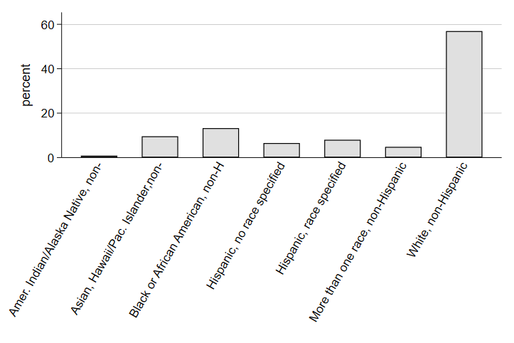
Note that by including the label modification , label(angle(60))) in the parentheses with the over command, we are telling Stata to shift the label of the variable in the command to a 60 degree angle. Since the labels are quite long for the race categories, angling the label can help us make a more legible graph.
Now, let’s take a look at the relationship between some continuous variables, like we did last week and look at a measure of their correlation. We’ll start with math test scores measures in two different years: 10th grade and 12th grade. We will start by summarizing the data.
sum math12 math10

    Variable |        Obs        Mean    Std. dev.       Min        Max
-------------+---------------------------------------------------------
      math12 |     13,648    50.66394    10.11226      19.82      79.85
      math10 |     15,892    50.71016    9.912398      19.38      86.68
As we can see, the test scores are pretty standard with a mean of about 51 and a standard deviation of about 10 points.
Note: We can see that the number of observations for 12th grade math scores is lower than the number for 10th grade math scores. Panel studies often experience declining participation over time - people decide they do not want to be in the study any more or they move and researchers cannot find them - and, consequently, the “base year” of the sample is often the largest. Researchers and study designers know this and design their panel studies to account for these changes in the sample over time.
Here’s a good opportunity to practice scatterplots. We might expect that, since these are all the same students, 10th grade math performance has a strong, positive relationship with 12th grade math performance. If we saw the reverse, we might be really worried about the validity of our tests, the quality of our nation’s high schools, or both!
scatter math12 math10
graph export "output\scatter1_lab3.png", as(png) replace
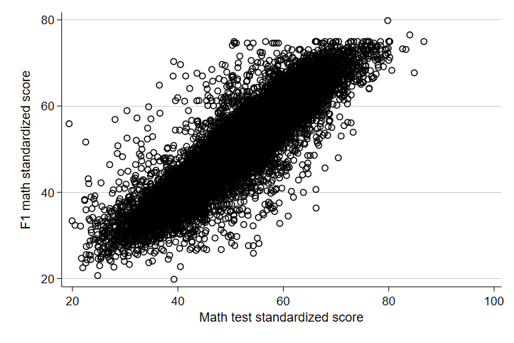
Whew. The relationship looks positive and seems to be pretty strong. Notice that the 12th grade score is listed first in the code above. Again, you should always get in the habit of thinking about the outcome as the Y-axis variable and in Stata, the Y-axis variable always comes first. Now, let’s see just how correlated scores are in the same subject across years.
. corr math12 math10
(obs=13,394)

             |   math12   math10
-------------+------------------
      math12 |   1.0000
      math10 |   0.8870   1.0000
We have an r coefficient of about 0.89! That’s a pretty strong, positive relationship between scores in 10th grade and scores in 12th grade. Of course, it stands to reason that if someone is struggling or excelling in something, past measures of ability will likely be highly correlated with future measures. Let’s see how correlated two different abilities, math and reading, measured at the same time are. Here, we are less worried about the order, but for consistency, let’s treat 10th grade math as the X-axis variable and now treat 10th grade reading scores as the Y-axis.
Note: that the number of observations is a little lower. This is because when calculating the Pearson’s R, Stata automatically excludes observations that are missing either of the variables - so students who only participated in 10th grade or only participated in 12th grade are automatically dropped. There are advanced techniques for using other information about the students to impute estimated scores, but that is both outside the scope of this course and often inadvisable. Generally, researchers refer to the “analytic sample” when discussing the sample used in their analysis to reflect the fact that some observations were excluded from the analysis due to missing data.
scatter read10 math10
graph export "output\scatter2_lab3.png", as(png) replace
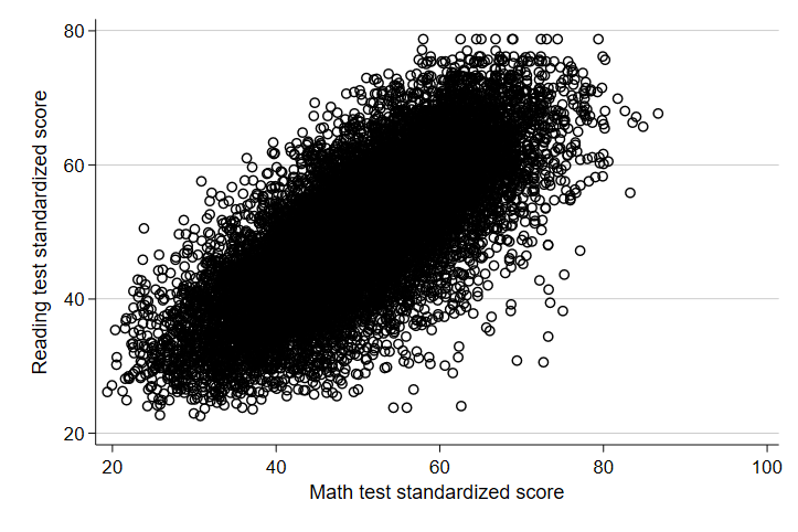
When looking at measures of different skills measured in the same year, there seems to be a similar - though perhaps slightly weaker - relationship. Let’s look at the Pearson’s r for math and reading scores.
. corr read10 math10
(obs=15,892)

             |   read10   math10
-------------+------------------
      read10 |   1.0000
      math10 |   0.7469   1.0000
We see an r of 0.7469, still quite high but not as high as 10th and 12th grade math. This is actually somewhat intuitive, since math is a special language. Struggles in one language will often, though not always, bleed over into struggles in another.
Relationships Between Categorical Variables
Now, this week, we learned more about categorical variables and some ways to estimate the relationship between categorical variables. Let’s start by looking at the scatter plot of two categorical variables. For our purposes, we will look at parent’s level of education and the level of education their children have as adults.
scatter adulteduc paredshort
graph export "output\scatter3_lab3.png", as(png) replace
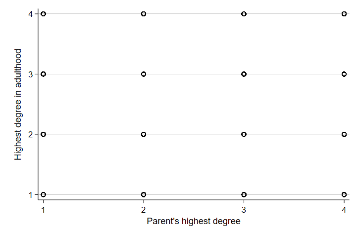
The scatter plot is utter nonsense. The data points all stack on each other in each intersection of categories and there’s no way to really tell what’s happening. In part, this is because categorical variables have different mathematical properties than continuous variables. In addition, measures of center in categorical variables don’t always mean much. As an example, let’s summarize the educational attainment in our sample.
. sum adulteduc

    Variable |        Obs        Mean    Std. dev.       Min        Max
-------------+---------------------------------------------------------
   adulteduc |     13,250    3.226415    .7388569          1          4
Note that the mean does not tell us much about educational attainment because no single observation can fall between categories. Instead, for categorical variables, and especially for thinking about the relationship between two categorical variables, we need to think about the distribution of observations across categories and the joint distribution of the two categories. We do this by tabulating observations into two-way tables, also known as calculating the crosstabs. You will hear this often in discussions about polling and surveys. It refers to the joint distribution of two categorical variables! By hand, calculating these things is long and time consuming, but in Stata, this is actually quite simple. We will use the tabulate command. First, let’s just look at the tabulate command on one variable. In Stata, you can use the full command, tabulate, or the abbreviation: tab.
. tab adulteduc

 Highest degree |
   in adulthood |      Freq.     Percent        Cum.
----------------+-----------------------------------
   Less than HS |        356        2.69        2.69
        HS only |      1,388       10.48       13.16
   Some college |      6,406       48.35       61.51
College or more |      5,100       38.49      100.00
----------------+-----------------------------------
          Total |     13,250      100.00
As with summarize, you can list out the two variables you want to calculate crosstabs for and add a simple option to calculate the marginal and conditional distributions. Let’s look at the relationship between parent’s education and adult education.
. tab paredshort adulteduc, column

+-------------------+
| Key               |
|-------------------|
|     frequency     |
| column percentage |
+-------------------+

   Parent's highest |         Highest degree in adulthood
             degree | Less than    HS only  Some coll  College o |     Total
--------------------+--------------------------------------------+----------
Parent less than HS |        71        142        399        107 |       719
                    |     19.94      10.23       6.23       2.10 |      5.43
--------------------+--------------------------------------------+----------
     Parent HS only |       112        475      1,276        502 |     2,365
                    |     31.46      34.22      19.92       9.84 |     17.85
--------------------+--------------------------------------------+----------
Parent some college |        89        467      2,374      1,173 |     4,103
                    |     25.00      33.65      37.06      23.00 |     30.97
--------------------+--------------------------------------------+----------
    Parent college+ |        84        304      2,357      3,318 |     6,063
                    |     23.60      21.90      36.79      65.06 |     45.76
--------------------+--------------------------------------------+----------
              Total |       356      1,388      6,406      5,100 |    13,250
                    |    100.00     100.00     100.00     100.00 |    100.00
Now, let’s add the conditional distribution for the rows.
. tab paredshort adulteduc, column row

+-------------------+
| Key               |
|-------------------|
|     frequency     |
|  row percentage   |
| column percentage |
+-------------------+

   Parent's highest |         Highest degree in adulthood
             degree | Less than    HS only  Some coll  College o |     Total
--------------------+--------------------------------------------+----------
Parent less than HS |        71        142        399        107 |       719
                    |      9.87      19.75      55.49      14.88 |    100.00
                    |     19.94      10.23       6.23       2.10 |      5.43
--------------------+--------------------------------------------+----------
     Parent HS only |       112        475      1,276        502 |     2,365
                    |      4.74      20.08      53.95      21.23 |    100.00
                    |     31.46      34.22      19.92       9.84 |     17.85
--------------------+--------------------------------------------+----------
Parent some college |        89        467      2,374      1,173 |     4,103
                    |      2.17      11.38      57.86      28.59 |    100.00
                    |     25.00      33.65      37.06      23.00 |     30.97
--------------------+--------------------------------------------+----------
    Parent college+ |        84        304      2,357      3,318 |     6,063
                    |      1.39       5.01      38.88      54.73 |    100.00
                    |     23.60      21.90      36.79      65.06 |     45.76
--------------------+--------------------------------------------+----------
              Total |       356      1,388      6,406      5,100 |    13,250
                    |      2.69      10.48      48.35      38.49 |    100.00
                    |    100.00     100.00     100.00     100.00 |    100.00
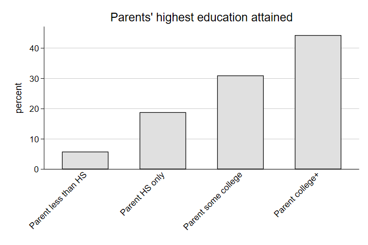
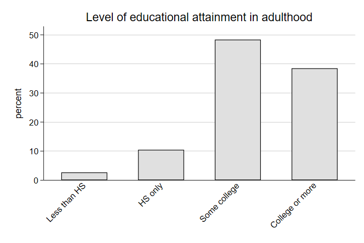
We can use bar graphs to present the marginal distributions of the sample slightly differently. Notice that I am adding a new option, a title, to make the difference in the bar graphs clear. I generally recommend not using this option, since you can add titles to graphs in the text of the document for which you are creating the graphs (a report, analysis, manuscript, etc.). However, in some contexts, adding a quick title can be handy. Note that anything in the parenthesis of the title option will be added as the title of the graph at the top of the graph.
graph bar, over(paredshort, label(angle(45))) title(Parents' highest education attained)
graph export "output\bar2_lab3.png", as(png) replace

graph bar, over(adulteduc, label(angle(45))) title(Level of educational attainment in adulthood)
graph export "output\bar3_lab3.png", as(png) replace
Let’s look at intergenerational transfers of income. The general logic here is we can see what proportion of those who are wealthy (or poor) in adulthood came from wealthy (or poor) households in high school. Without intergenerational transfers of income, we might expect high-earners in adulthood to come from both low-income families and high-income families at similar rates. The size of the gap in this conditional distribution might suggest an additional benefit to being born into a high-earning family that lasts into adulthood. A quick two-way table in Stata would look like this:
. tab byhhincome adultincome, column

+-------------------+
| Key               |
|-------------------|
|     frequency     |
| column percentage |
+-------------------+

  Total family income |
from all sources 10th |        Income from earnings in 2012
                grade | Less than   $20K-50K  $50K-100K  100K or m |     Total
----------------------+--------------------------------------------+----------
Less than $20K (10th  |     1,100        614        101         15 |     1,830
                      |     17.74      10.87       8.00      10.79 |     13.81
----------------------+--------------------------------------------+----------
$20K-50K (10th grade) |     2,378      1,961        339         37 |     4,715
                      |     38.34      34.73      26.86      26.62 |     35.58
----------------------+--------------------------------------------+----------
$50K-100K (10th grade |     1,923      2,159        503         45 |     4,630
                      |     31.01      38.23      39.86      32.37 |     34.94
----------------------+--------------------------------------------+----------
  $100K+ (10th grade) |       801        913        319         42 |     2,075
                      |     12.92      16.17      25.28      30.22 |     15.66
----------------------+--------------------------------------------+----------
                Total |     6,202      5,647      1,262        139 |    13,250
                      |    100.00     100.00     100.00     100.00 |    100.00
Looking at the distribution of family earnings in the highest income category, only 12.24% of observations came from a low-income family. Meanwhile, 31.63% came from a high-income family, a fairly sizable gap. This is underscored when we look at the marginal distribution of family income; only 16% of the sample came from a high-income family, suggesting that high-earning adults disproportionately come from high-income families. Let’s see if this looks different for boys and girls. Starting with boys:
. tab byhhincome adultincome if bysex == 1, column

+-------------------+
| Key               |
|-------------------|
|     frequency     |
| column percentage |
+-------------------+

  Total family income |
from all sources 10th |        Income from earnings in 2012
                grade | Less than   $20K-50K  $50K-100K  100K or m |     Total
----------------------+--------------------------------------------+----------
Less than $20K (10th  |       385        301         57         12 |       755
                      |     16.00      11.17       7.52      12.24 |     12.67
----------------------+--------------------------------------------+----------
$20K-50K (10th grade) |       906        957        209         25 |     2,097
                      |     37.66      35.51      27.57      25.51 |     35.20
----------------------+--------------------------------------------+----------
$50K-100K (10th grade |       750      1,030        322         30 |     2,132
                      |     31.17      38.22      42.48      30.61 |     35.79
----------------------+--------------------------------------------+----------
  $100K+ (10th grade) |       365        407        170         31 |       973
                      |     15.17      15.10      22.43      31.63 |     16.33
----------------------+--------------------------------------------+----------
                Total |     2,406      2,695        758         98 |     5,957
                      |    100.00     100.00     100.00     100.00 |    100.00
And now girls:
. tab byhhincome adultincome if bysex == 2, column

+-------------------+
| Key               |
|-------------------|
|     frequency     |
| column percentage |
+-------------------+

  Total family income |
from all sources 10th |        Income from earnings in 2012
                grade | Less than   $20K-50K  $50K-100K  100K or m |     Total
----------------------+--------------------------------------------+----------
Less than $20K (10th  |       658        288         38          3 |       987
                      |     19.01      10.62       8.50       8.11 |     14.82
----------------------+--------------------------------------------+----------
$20K-50K (10th grade) |     1,362        912        115         10 |     2,399
                      |     39.34      33.63      25.73      27.03 |     36.03
----------------------+--------------------------------------------+----------
$50K-100K (10th grade |     1,053      1,037        162         15 |     2,267
                      |     30.42      38.24      36.24      40.54 |     34.05
----------------------+--------------------------------------------+----------
  $100K+ (10th grade) |       389        475        132          9 |     1,005
                      |     11.24      17.51      29.53      24.32 |     15.09
----------------------+--------------------------------------------+----------
                Total |     3,462      2,712        447         37 |     6,658
                      |    100.00     100.00     100.00     100.00 |    100.00
It appears women receive much less of an intergenerational transfer of earnings than men. While about 16% of men in this cohort find their way to the highest earnings category in adulthood, 31.6% of high-earning men came from a wealthy household - a 15 percentage point bump in the likelihood of being wealthy adults. For women, about 15% of the cohort makes it into the highest earnings category. Meanwhile, only 24% of wealthy women from the cohort come from wealthy households - a 9 percentage point bump.
Making Tables
Installing a Package
Wouldn’t it be nice if we could use Stata to make prettier tables so we could have results from our analyses ready to add to a report with only minor formatting adjustments? Fortunately, there are commands available that allow us to store our analyses in Stata’s temporary memory and export our estimates into a table in a format of our choosing. For now, we will use .csv formats, which can be opened and edited in Excel and then copied into our word documents.
For starters, you will need to install new command in Stata. Stata houses a library of additional commands in a cloud that can be downloaded and used at any time. Installing commands is easy - simply type ssc install and then the name of the command you are trying to install. For our purposes, you will type:
ssc install estout, replace
estout includes a suite of commands useful for storing estimates and exporting them into tables. The commands are very flexible and can be customized for a variety of different purposes, but we will keep things simple for our class. For this example, we will create a summary table with the means and standard deviations of test scores and a two-way table with the joint distribution of parents’ education and the adult attainment of their children. We will do this with just two lines of code and a handful of options. I will introduce each option bit by bit and show the output so that you understand what the options do.
Summary Statistics
First, summary statistics. We begin by running the same summary statistics table we always do. This time, however, we add estpost to the front of the command, like so:
estpost sum read10 math10
…and the output in Stata will contain the same information as before, mean, S.D., and so on, but will look a little different:
             |  e(count)   e(sum_w)    e(mean)     e(Var)      e(sd)     e(min)     e(max)     e(sum)
-------------+----------------------------------------------------------------------------------------
      read10 |     15892      15892   50.52618   97.72094    9.88539      22.57      78.76   802962.1
      math10 |     15892      15892   50.71016   98.25563   9.912398      19.38      86.68   805885.8
This is because the estpost command at the beginning tells Stata to store the estimates of the rest of the line of code in the temporary memory of Stata. The title of each column refers to what Stata has labeled the output in its memory. This is important because we will use this in the second step to tell Stata which measures we want to export in our formatted table. For our purposes, we want the mean and the standard deviation. The most basic format of the code is:
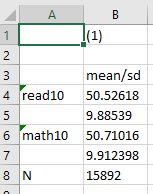
esttab using "output\table1.csv", cell(mean sd)
The path above works the same way as the path for exporting graphs; it tells Stata where to store the output, what to call the output (in this case, table1), and what format to use (in this case, csv). This basic version of the table looks like this:
We can also add some options to specify a decimal place and have the standard deviation reported in parentheses (a common practice to differentiate the two measures). To do this, we simply add the following options:
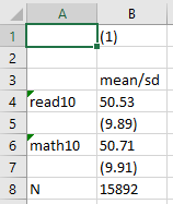
esttab using "output\table1b.csv", cell(mean(fmt(2)) sd(fmt(2) par))
…which will look something like:
Now we have a cleaner look, rounded to two decimals, with the standard deviation easy to identify in parentheses. Finally, we will add replace, which tells Stata to replace any existing output with the same name in the same location with a new output, and label, which tells Stata to use variable labels instead of names, to the code:
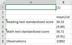
esttab using "output\table1c.csv", cell(mean(fmt(2)) sd(fmt(2) par)) label replace
And here we have a nice looking table with the means and standard deviations of our variables.
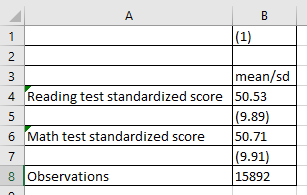
In Excel, we can then add borders to our table using the borders dropdown and selecting “All borders” to get this:
…and we can copy and paste the table into our word document for a nicer presentation of our results. Remember, in the homeworks, include the code used to run the analysis and produce the table.
Summary Tables with Subgroups
Now, let’s say we are working with a categorical variable, say gender (bysex in the ELS), and a continuous variable like test scores. Here, we will combine the summary analysis by group that we did in Class Lab 1 with the process above for making tables. Our continuous variable will be our row variable and we will have a new column for each category. To do this, we add a few additional lines of code:
estpost sum read10 math10 if bysex == 1
est sto boys
estpost sum read10 math10 if bysex == 2
est sto girls
esttab boys girls using "output\table1d.csv", cell(mean(fmt(2)) sd(fmt(2) par)) label replace
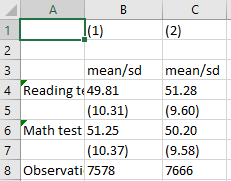
In the code above, we are running our summary statistics of math and reading scores in 10th grade, just like we did above, but we are doing it twice: once for only boys and once for only girls. To create a table from this separate process, we need to store the statistics for boys and girls in Stata’s temporary memory. For that, after we run our summary statistics, we use est sto boys to tell Stata to store the statistics (the est sto command) and to label the statistics boys for us to reference them later. We do the same for girls. Finally, we tell Stata to create a table, the same way we did before, but this time we add boys girls before the using command so that Stata knows to use the boys statistics and the girls statistics for the columns in the new table. We should end with a table that looks like this:
Column 1 is boys and column 2 is girls because that was the order we listed the statistics in our esttab command. It looks like in this cohort, girls scored a little higher in their reading and language skills while boys scored a little higher on their math skills in 10th grade.
Two-Way Tables
For a two way table, the process is similar. We start with running a tab of two categorical variables led by estpost:
estpost tab paredshort adulteduc
And the basic structure of our output code is similar:
esttab using "output\table2.csv", cell(b colpct)
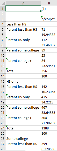
Here, however, the statistics we ask for are b, which is the number of observations in a particular cell, and colpct, which is the percent of a column represented in a particular cell. Notice that when using tab and categorical variables, the basic code above produces a table that is hard to read or work with:
The output continues on beyond the screen in a single long column. This is because Stata defaults to stacking all the categories on top of one another. The correction to this is simple:
esttab using "output\table2.csv", cell(b colpct) unstack
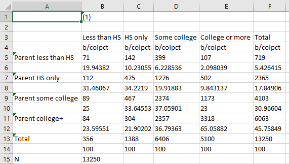
Adding unstack to the code tells Stata not to stack the two variables and their categories on one another:
Much better! But still, we likely want to fix the decimal places and make it easier to distinguish between the count in a cell and the column percent. We do this the same way we did before:
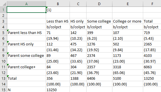
esttab using "output\table2.csv", cell(b colpct(fmt(2) par)) unstack
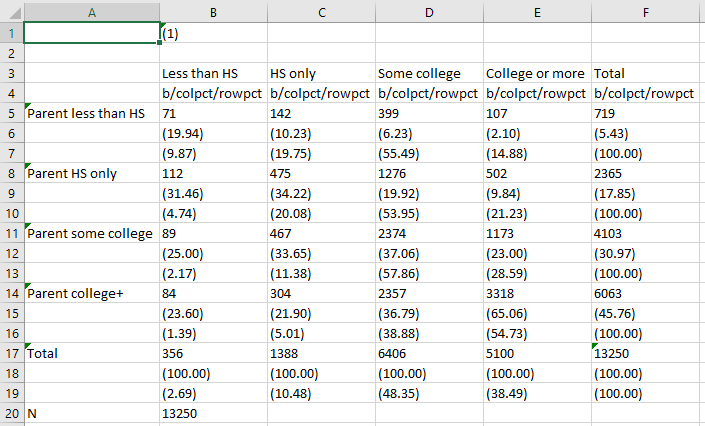
Look at how nice and clear that is! Finally, in two-way tables, we sometimes might be interested in both the conditional distribution of the columns (column percentages) and the conditional distribution of the rows (row percentages). Including both in our table in Stata is easy - we simply add rowpct as a measure to be included in the cells of the table and the same formatting instructions we use for column percentages.
Tip: A good rule of thumb for tables is that you want to have all estimates rounded to the same decimal point. The count of observations is an exception to this rule because observations are discrete counts, but for statistics like means, percentages, and standard deviations, reporting them in a consistent format (including rounding) is a good standard to keep in mind. One helpful thing about working in code is you can use the code for previous tables as a starting point for future tables and only adjust as needed.
esttab using "C:\\table2.csv", cell(b colpct(fmt(2) par) rowpct(fmt(2) par)) unstack
Now our table looks something like this:
Here, we can see the conditional distributions of the row variable included underneath the conditional distribution of the column variable.

