Class Lab 7
Simple Linear Regression
To illustrate the concepts and uses of linear regression for analysis, we will be using data from the National Health Interview Survey (NHIS), which is an annual survey of a nationally representative sample of the U.S. population and asks a host of questions about health and health related behaviors and programs. For our example of a simple linear regression, we will be looking at one relationship that we theorize exists in the world to test hypotheses about these relationships. We will look at the relationship between body mass index (BMI) and exercise frequency. BMI is a proxy measure of obesity and scores outside the healthy range of 18 to 22 or so can suggest an increased risk of diseases like diabetes. For regression analysis, we assume that there is a linear relationship in the population:
\[BMI_i = \beta_0 + \beta_1 Exercise_i + \varepsilon_i\]where every additional period of exercise a person i engages in will yield a change of BMI equal to $\beta_1$.
Continuous Outcome and Continuous Independent Variable
Beginning with our first model, the link between BMI and exercise, we have a theory that the relationship in the population looks like:
\[BMI_i = \beta_0 + \beta_1 Exercise_i + \varepsilon_i\]We have a simple random sample of 300 people from the NHIS. We want to know i) the size of $\beta_1$ and ii) the direction of $\beta_1$. In a linear regression world, we will always adopt a null hypothesis that our independent variable, x, is unrelated to our outcome, y, or, put another way, that $\beta_1$ equals 0.
Let’s begin by looking at a scatter plot of exercise and BMI from our sample. Remember that in Stata, the dependent variable (Y) always comes first in the code.
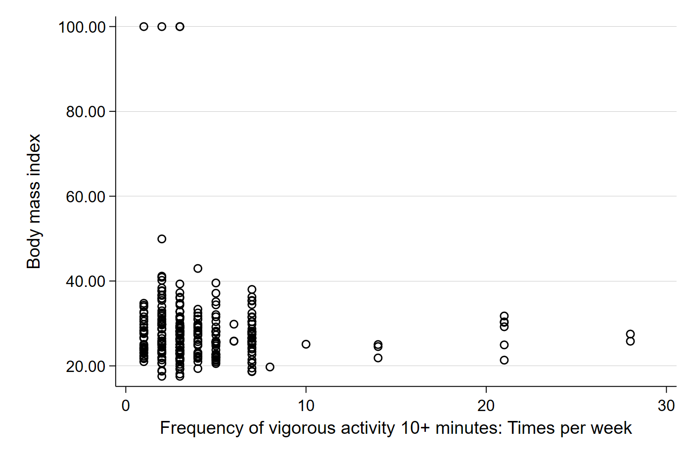
scatter bmi vig10fwk
We should get something like:

Visually, we can kind of see a small negative direction in the data. The dots farther out in the x-axis seem to be lower on the y-axis, which suggests that those who exercise more have a lower BMI. Importantly, each plot point represents the observed BMI ($Y_i$) and observed exercise frequency ($X_i$) for each individual in our sample. Let’s add the best fit line to better see the relationship in our sample.
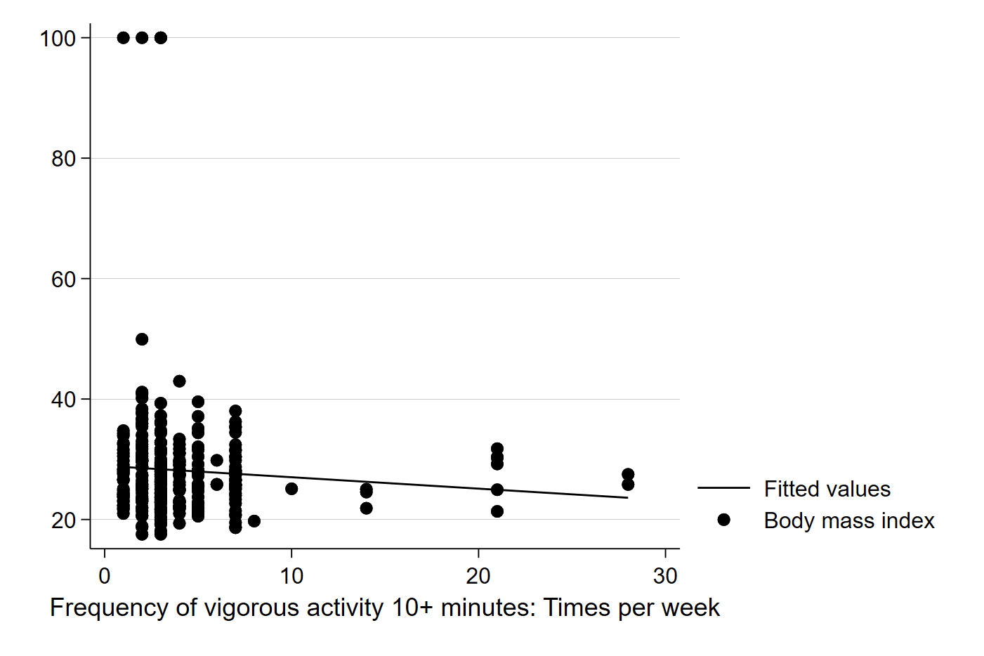
graph twoway (lfit bmi vig10fwk) (scatter bmi vig10fwk)
The above code uses the two-way graphing function in Stata, a powerful tool that can be used for generating all kinds of interesting graphs and plots. In this case, we are telling Stata to graph and best fit line of these two variables (BMI and exercise frequency) and impose it on a scatter plot of the two variables. It should generate a graph like this:

Here, Stata has calculated the best fit line for us, and does seem to suggest that more exercise is associated with a slightly lower BMI. Note that calculating the best fit line ourselves would involve first calculating the slope:
\[\beta_1 = \dfrac{\sum (x_i - \overline{X})(y_i - \overline{Y})}{\sum (x_i - \overline{X})^2}\]…and then using the basic form of a line to calculate the intercept:
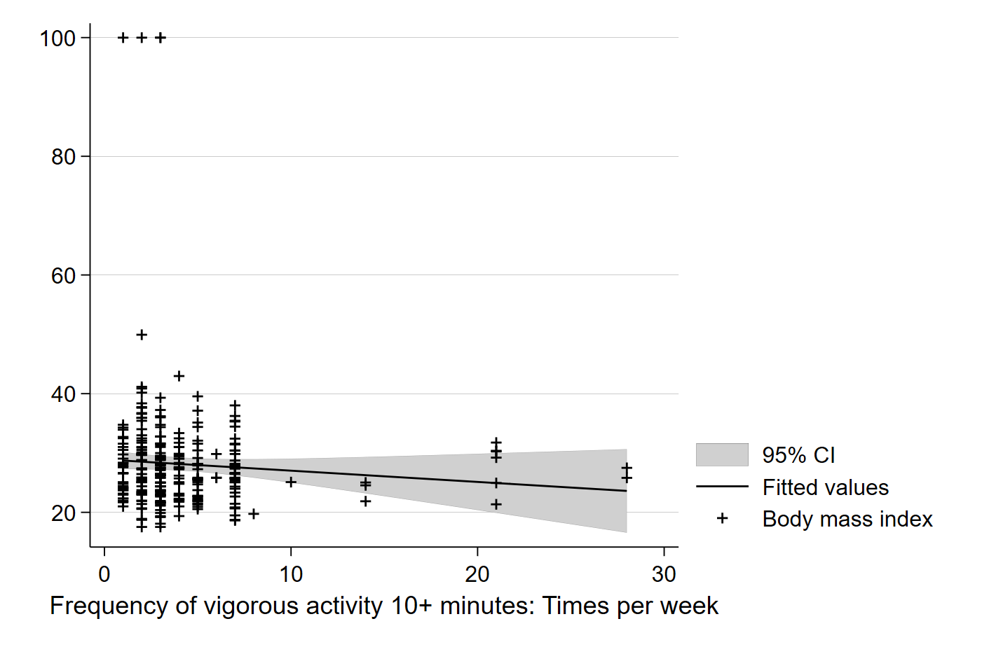
\[\beta_0 = \overline{Y} - \beta_1 \overline{X}\]Now, we know our line is just based on a sample and could be incorrect due to sampling error. We can also have Stata add the confidence interval of the line to see the range in which we can be 95% confident the true population relationship between BMI and exercise rests:
graph twoway (lfitci bmi vig10fwk) (scatter bmi vig10fwk)
Simply adding ci to the lfit command will tell Stata to include confidence intervals in the graph of the best fit line. The default in Stata is 95% C.I.’s, but you can use options to change the default.

We can see the confidence interval plotted in the lighter grey area, which captures the confidence interval in our estimated value of Y (here, BMI) for each value of X (here, number of exercise periods per week). Note that each point on the line has a specific BMI value, $\hat{Y_i}$, which is the predicted value of BMI for each number of exercises per week based on our sample.
As always, we want something more precise than an eyeball guess at a graph. Moreover, we might have an even harder time reading a graph if the sample is larger than 300. For that reason, we use our data to estimate the exact value of the slope and estimate a standard error that we can use for inference. Doing this in Stata is simple:
reg bmi vig10fwk
…and your output will look like:
. reg bmi vig10fwk

      Source |       SS           df       MS      Number of obs   =       300
-------------+----------------------------------   F(1, 298)       =      1.63
       Model |  154.191864         1  154.191864   Prob > F        =    0.2022
    Residual |  28127.7304       298   94.388357   R-squared       =    0.0055
-------------+----------------------------------   Adj R-squared   =    0.0021
       Total |  28281.9223       299  94.5883687   Root MSE        =    9.7154

------------------------------------------------------------------------------
         bmi | Coefficient  Std. err.      t    P>|t|     [95% conf. interval]
-------------+----------------------------------------------------------------
    vig10fwk |  -.1895639   .1483147    -1.28   0.202    -.4814408    .1023129
       _cons |   28.91761   .8364125    34.57   0.000     27.27159    30.56363
------------------------------------------------------------------------------
In the top right corner of the output, we some information about our sample and some measures of our model’s fit with the data. Note that the R-squared in the output is the ratio of the sum of squared residuals of the model (SSM) to the sum of squared residuals in the sample (SST). This tells us that our model of BMI as a function of only exercise frequency explains about 0.55 percent of the variation of BMI observed in our sample. The top left corner provides the breakdown of the residuals in the sample and model. Note that dividing the Model SS by the Total SS will give you the same answer as the R-squared to the right.
Finally, the main event and exciting action is happening in the table at the bottom of the output. Here, each row represents all the estimates of a parameter in our model. In this simple case, we have one independent variable (exercise frequency) and the constant _cons in the output), which is the intercept of the model. Coefficient gives us our estimated coefficients ($\beta_1$ for exercise and $\beta_0$ for the intercept), Std. Err. provides the standard error associated with that estimated coefficient, t provides the calculated t-score associated with the estimated coefficient, P>|t| tells us the p-value associated with the t-score, and finally, 95% Conf. Interval is the 95% confidence interval for each estimate in the model. In short, Stata estimates all of the parameters that we need for statistical inference.
Here, the output tells us that each additional period of exercise per week that someone adds will, on average, decrease their BMI by about 0.19 points. However, the p-value is quite high (0.202) and the 95% confidence interval includes 0 as a possible value for the true $\beta_1$ in the underlying population. Together, these estimates suggest we cannot confidently reject the null hypothesis that there is no statistically meaningful relationship between exercise frequency per week and BMI. Exercise may improve other measures of health, but it does not seem to impact BMI, at least not without accounting for other possible confounders. The low R-squared gives us a clue that there might be a lot of other things that affect BMI that we do not observe here. More research is needed to better understand BMI. (HOORAY!!)
